
Customization
The default styles for the Sheet component somewhat follows the styles of the previously mentioned iOS Modal View. However, if these default styles are not to your liking it’s easy to make changes to them: you can provide a custom header or you can overwrite any style with CSS via the exposed class names.
Custom header
Section titled “Custom header”Adding a custom header is as simple as providing your own header as the child component to Sheet.Header:
function Example() { return ( <Sheet> <Sheet.Container> <Sheet.Header> <YourCustomSheetHeader /> </Sheet.Header> <Sheet.Content>{/*...*/}</Sheet.Content> </Sheet.Container> <Sheet.Backdrop /> </Sheet> );}Custom styles
Section titled “Custom styles”You can add your own styles or override the default sheet styles via the exposed class names.
Unstyled mode
Section titled “Unstyled mode”For complete control over the sheet’s appearance, you can use the unstyled prop to remove all decorative styles while keeping only the essential functional styles.
When unstyled={true} is set on the root Sheet component, it removes decorative styles like: border radius, shadows, and background colors:
function UnstyledExample() { return ( <Sheet unstyled> <Sheet.Container> <Sheet.Header /> <Sheet.Content>{/* Your content */}</Sheet.Content> </Sheet.Container> <Sheet.Backdrop /> </Sheet> );}The unstyled prop can also be applied to individual sheet components to selectively remove their decorative styles:
function SelectiveUnstyledExample() { return ( <Sheet> <Sheet.Container unstyled> <Sheet.Header /> <Sheet.Content>{/* Your content */}</Sheet.Content> </Sheet.Container> {/* Keep the backdrop styled */} <Sheet.Backdrop /> </Sheet> );}This is particularly useful when building custom designs or when integrating with design systems that require complete control over styling.
You can also remove all styles at the root level and then override it for individual components if you want to keep some default styles:
function MixedUnstyledExample() { return ( <Sheet unstyled> <Sheet.Container> <Sheet.Header /> <Sheet.Content>{/* Your content */}</Sheet.Content> </Sheet.Container> <Sheet.Backdrop unstyled={false} /> </Sheet> );}CSS Modules
Section titled “CSS Modules”import styles from './styles.module.css';
function Example() { return ( <Sheet> <Sheet.Container className={styles.sheetContainer}> <Sheet.Header className={styles.sheetHeader} /> <Sheet.Content className={styles.sheetContent}>{/*...*/}</Sheet.Content> </Sheet.Container> <Sheet.Backdrop className={styles.sheetBackdrop} /> </Sheet> );}.sheetContainer { /* custom styles */}.sheetHeader { /* custom styles */}.sheetContent { /* custom styles */}.sheetBackdrop { /* custom styles */}Vanilla CSS
Section titled “Vanilla CSS”You can also use vanilla CSS to override the styles by targeting the exposed class names:
.react-modal-sheet-backdrop { /* custom styles */}.react-modal-sheet-container { /* custom styles */}.react-modal-sheet-header { /* custom styles */}.react-modal-sheet-header-container { /* custom styles */}.react-modal-sheet-drag-indicator-container { /* custom styles */}.react-modal-sheet-drag-indicator { /* custom styles */}.react-modal-sheet-content { /* custom styles */}Styling the examples
Section titled “Styling the examples”The documentation examples use Panda CSS with styled(Component, { base: { ... } }) definitions below their React markup. Astro templates use named css() classes in the same file. Styles are extracted at build time. Shared buttons use Panda recipe variants; Motion values and other runtime values remain in the React style prop.
See the Panda styling guide for details.
Custom styles example
Section titled “Custom styles example”You can customize the sheet quite a lot if you get creative with the styles.
Here’s an example how a totally custom sheet could look like:
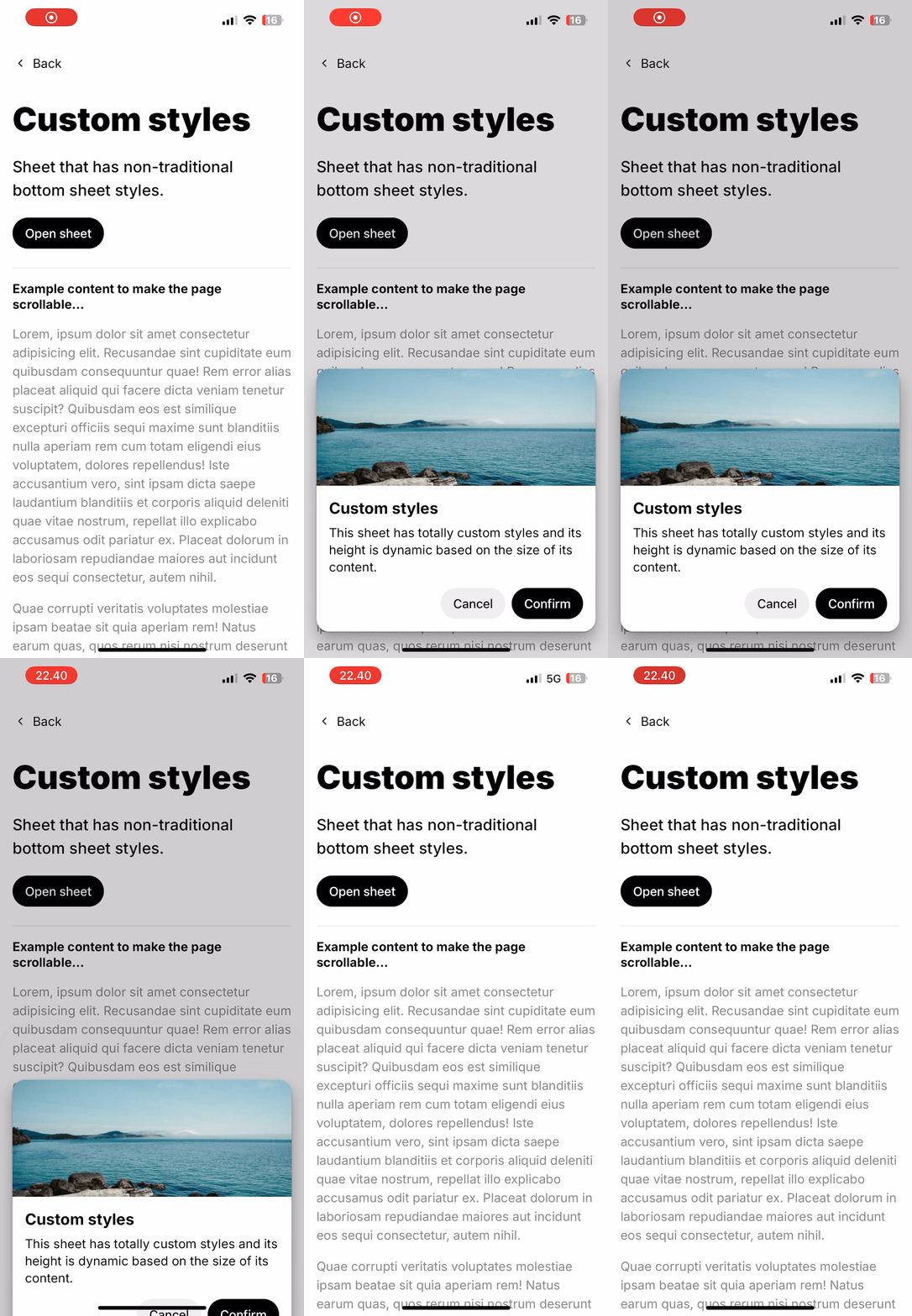
See the CustomStyles component to view the full implementation of the above example.